The thing about logos and jerseys is that some people love them, and some people hate them.
Love doesn't produce content, though. Ever seen a story on the internet about how great some team's jersey is? Didn't think so. But in this case, the Blue Jackets are in Deadspin's crosshairs.
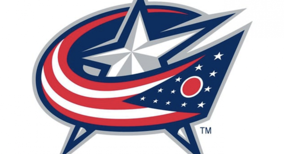
A recent story published puts the Blue Jackets in some pretty brutal company: the Tennessee Titans (admittedly, a terrible logo), the Cleveland Browns (meh) and the Brooklyn Nets (legit clip art) are mentioned in the piece. The Blue Jackets have a clean primary logo but someone's always going to find something to hate about it, right?
Here's what Deadspin writer Drew Magary thinks:
This team was named after union army jackets, and yet they opted for a logo where the Ohio flag is wrapped backwards around a star.
Is the design a bit strange? Sure. But we're failing to mention here that the flag is wrapped backwards in a "C" standing for Columbus, and it's wrapped around a star that signifies the capital of Ohio.
What do you think of the Blue Jackets logo? Let us know in the comments.