Yep. This is where we've gotten to.
There is not much hockey news surrounding the Columbus Blue Jackets at the moment, so we're going to be talking about their elaborate jersey history. Join us, would you?
In their 20-plus year history, the Blue Jackets have only had three major jersey schemes, with slight modifications throughout. One of those styles was an alternate, too, meaning just two "main" home and away sweater sets have been put out by the club.
Of those three schemes, there have been seven different "eras" in which they lived. Here are my incredibly subjective rankings of those jersey eras that the Blue Jackets have run through since their inauguration. Let me know your thoughts in the comments on where you would rank each!
Also, shoutout to nhluniforms.com for an easy way to view every club's jersey history.
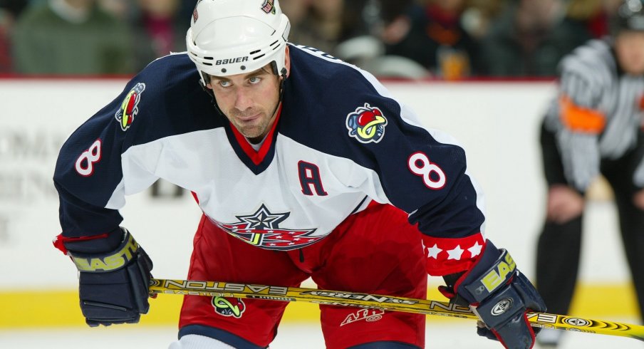
#7 (2003-2007)
This was the year unveiling the logo that is still present amongst main Blue Jackets jerseys today. The logo is nice, but the alternate jersey around it is just comically awful. The black stripes are clunky and out of place, and the stars running down the sleeve just seem unnecessary. They figured it out eventually, thankfully.
Obviously, the original home and away jerseys are still awesome.

#6 (2007-2010)
It was a step in the right direction. The stars are gone from the sleeves and the black stripes were removed, but they just lack the crispness of the modern-day sweaters. The numbers also scream "peewee team".

#5 (2010-2015)
The third jersey arrives! I think I will always have a bad taste in my mouth looking at those jerseys because they arrived in just the darkest Blue Jackets years. However, if I look at them objectively, they're pretty sweet. The home and away jerseys took an upgrade to their number font, but the socks and trimming could use some work still.

#4 (2015-2017)
Literally, the only difference between these sweaters and the year prior is the shoulder patches and the sticker on the third jersey set. The shoulder patch makes a clean change, and the "BLUE JACKETS" font on the alternate uniforms looks nice and is still present today.

#3 (2017-2018)
Alas, the numbers are updated and the trimming is tweaked. These look really sharp, especially the road uniform. But, the third jersey was taken away (remember that?) for who knows what reason.

#2 (2000-2003)
I mean, these are just so classic. There is a simplicity to these, and the green adds just enough of a unique twist. The Stinger logo on the shoulder patches is hilarious, and the alternate logo on the buckets is a nice touch. The stripes on the socks and jersey bottoms look clean, too.

#1 (2018-Present)
Can't beat the present, can we? These current Columbus Blue Jackets jerseys are all-around pretty incredible in my opinion. There really isn't any part of the uniform that I would critique - the numbers and names are crisp, the socks don't make too much noise, and the pants and helmet combinations make the whole look flow.
